

:quality(80)/business-review.eu/wp-content/uploads/2024/07/VGP-Park-Timisoara_-8thbuilding_iulie-24.jpg)
:quality(80)/business-review.eu/wp-content/uploads/2023/04/WordPress3.png)
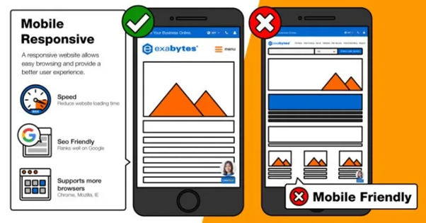
Nowadays, smartphones are become an extension of ourselves, it is imperative for businesses and website owners to adapt to the mobile-first paradigm. With more people accessing the internet through their mobile devices, having a mobile-friendly website is no longer a luxury but a necessity.
Additionally, ensuring website optimization is not everyone’s cup of tea therefore make sure to hire WordPress developers from India for better functionality. Why India? It’s because Indian developers are adaptive, up-to-date with tech trends, and highly knowledgeable in tech industries.

In this blog, we will explore the importance of mobile-friendly sites, delve into the steps you can take to make your WordPress website mobile-friendly and learn how to test its mobile responsiveness.
Let’s get started!

Why Are Mobile-Friendly Websites Important?
Mobile devices have revolutionized the way we consume content and engage with websites. Here are some statistics to prove the statement:

- According to Statista, as of 2021, there are over 3.8 million smartphone users worldwide, projected to increase to 4.3 billion by 2023.
- Google’s mobile-first indexing prioritizes mobile-friendly websites in search engine rankings, leading to better visibility and increased organic traffic.
- A study conducted by Google found that 53% of mobile site visitors abandon a page that takes longer than three seconds to load, highlighting the need for optimized mobile experiences.
- E-commerce in mobile devices is on the rise, with global mobile commerce sales expected to reach $3.56 trillion by 2021, accounting for 72.9% of total E-commerce sales.

Now that we understand the significance of mobile-friendly sites, let’s dive into how you can make your WordPress website mobile-friendly.
How To Make Your WordPress Website Mobile-Friendly?
Here are some ways that can help you make your WordPress website mobile-friendly-
1. Execute A Responsive Mobile Version Of Your Website
Responsive web design ensures that your website automatically adapts to different screen sizes, providing an optimal viewing experience across devices. Many modern WordPress themes come with built-in responsiveness, or you can also use plugins like “Responsive Design” to make your website mobile-friendly.
2. Considering Incorporating Google Amp For WordPress
AMP means Accelerated Mobile Pages, which is an open-source initiated by Google. It enables lighting-fast loading of webpages on mobile devices. Implementing the Google AMP plugin on your WordPress website can significantly improve mobile page speed and enhance user experience.
1. Utilize Mobile-Optimized Plugins
WordPress offers a vast array of plugins designed specifically for mobile optimization. Plugins like “WPtouch” and “Jetpack” provide mobile-friendly themes, touch-friendly navigation, and other features that enhance your website’s mobile experience. Remember to choose plugins that align with your website’s requirements.
2. Don’t Use Flash
Abode Flash is not supported on mobile devices rendering any Flash elements on your website useless. Replace Flash elements with HTML5 or other mobile-friendly alternatives to ensure a seamless experience for mobile users.
3. Keep Content On Mobile And Desktop Sites The Same
Well, consistency is the key in delivering a better user experience. Therefore, it’s crucial to maintain the content on your mobile and desktop sites the same. It will allow users to access the same information regardless of the device they use, be it text, images, videos, or any other elements related to your website.
4. Simplify On-Site Graphics
Mobile devices have smaller screens therefore, it’s crucial to optimize your website’s graphics for mobile viewing. Compress images, reduce file sizes, and remove unnecessary visual elements that might hinder loading times or clutter the user interface.
How To Take The Mobille-Friendly Test For Your WordPress Website?
After the execution process, you can implement the necessary changes to make your WordPress site mobile-friendly; it’s essential to test its responsiveness.
Google offers a free Mobile-Friendly Test Tool that analyzes your website and provides recommendations for improvement. Simply enter your website’s URL, and the tool will assess its mobile-friendliness, highlighting any areas that need attention.
The test results may include the following:
- Mobile-friendly status- The tool indicates whether your website is mobile-friendly or not. If your website passes the test, it is optimized for mobile devices. If it fails, the tool will provide specific reasons for the failure.
- Page loading speed- This test also provides insights into your website’s loading speed on mobile devices. Slow loading times can negatively impact user experience, so it is crucial to address any speed-related issues.
- Usability recommendations- Google’s Mobile-Friendly Test may offer recommendations and suggestions to improve your website’s usability and mobile experience. These recommendations range from adjusting font sizes to optimizing touch elements and improving navigation.
Note- Based on the test results, note bugs and issues provided by the test tool. Consider implementing plugins and themes to avoid the problems.
Final Verdict
With mobile devices becoming the primary gateway to the online world, ensuring your website optimization is essential. Therefore, the mobile version of the WordPress website should be easily accessible and visually appalling to the audience.
Remember, a mobile-friendly website enhances user experience, boosts your search engine rankings, increases conversion rates, and opens doors to a wider audience. So, take the leap, optimize your WordPress website for mobile devices, and unlock new possibilities for your online presence!
You can always hire a dedicated WordPress developer if you want to create a mobile version of a website or blog that is highly customized, user-friendly, feature-rich, and optimized for search engine optimization (SEO). They can also help you create a secure website or blog free from malicious attacks.
:quality(30)/business-review.eu/wp-content/themes/business-review/assets/images/no-picture.png)

:quality(80)/business-review.eu/wp-content/uploads/2024/06/COVER-1-4.jpg)


:quality(80)/business-review.eu/wp-content/uploads/2024/06/br-june-2.jpg)