
:quality(80)/business-review.eu/wp-content/uploads/2024/04/Offline-vs.-Online-Wallet-Apps.jpg)
Read more about
:quality(80)/business-review.eu/wp-content/uploads/2020/10/unnamed-2.png)
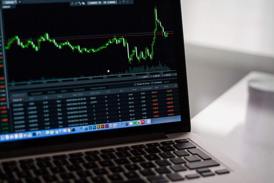
Candlesticks visually express the sentiments of the market and the price movements that go along with it. This way, traders are able to make decisions based on the patterns to help them interpolate the short-term direction of the price. It’s important to get to know about Candlestick charts in order to read them, here are some important details about it:
Understanding these charts requires you to be familiar with its components. As the professionals from Candleopedia.com explain, there are two contrasting colors black and white (but modern charts may use green and red). These colors distinguish the daily trend of the rates. Furthermore, the behavior is descriptively shown on how the candlestick appears in its size and form. Here are its major components:

a. Body
Depending on the color of the body, the upper limit could mean the closing price of the asset while the lower limit is the opening price. The length of the body indicates price change of a certain asset during that trading day.

b. Upward Wick/Shadow
The upward wick or shadow indicates the maximum price the asset has reached for that day. Its length represents that the highest price investors were willing to pay at some point.

c. Downward Wick/Shadow
The downward wick or shadow indicates the minimum price set by the sellers during trading. It also reflects how much of the value of the assets dipped throughout the day.

You will be able to see the direction of the price in a specific time frame by the color of its body and its positioning. If the color of the body is green or white, the price closed higher than when it opened. And if it’s red or black, the price closed lower than when it opened.
The distance between the top of the upper wick or shadow and the lower wick is the range of the price movements during that time frame. The range is calculated by obtaining the difference between the high price and lower price.
The different forms of Candlesticks represent different behavior of traders at a certain period in time, here is how it is interpreted:
a. Long Body
A white/green Candlestick with a long body indicates a bullish pattern wherein there’s a majority of buyers for that day. This resulted in a closing price much higher than the opening. In contrast, a black/red candle with a long body indicates a bearish day wherein sellers dominated and the closing price fell lower than the opening.
b. Short Body
A short body Candlestick reflects an equal strength in buyers and sellers. This resulted in an absence of a major price change during that trading day. It can also indicate a low activity level during that trading day.
c. Long Lower Wick/Shadow
This form indicates that throughout the day the sellers were dominating, hence a sizeable price drop represented by the down wick or shadow. But at the end, the buyers were able to rally resulting in a big gap between the closing price and the minimum price.
d. Long Upper Wick/Shadow
This form indicates the opposite of the previous form. This reflects buyer dominance throughout the day, which resulted in a significant price increase represented by a long upper wick or shadow. However, in the end, the trend adjusted which resulted in a closing price much lower than the maximum.
e. Two Long Wicks/Shadows with Short Body
A Candlestick with two long wicks or shadows indicates ambiguity. It shows that both buyers and sellers were dominating at certain periods during the day, but no one really prevailed at the end.
Candlesticks move in up and downwards relative to its price. Many of these movements may seem random but sometimes a pattern begins to emerge from the data set. Traders are able to analyze these patterns and predict its movements in the future.
a. Bullish
A bullish pattern indicates that investors are identifying securities that are potentially to increase in value and they are allocating funds to acquire those assets. Prices will likely increase given this pattern.
b. Bearish
The opposite of bullish, a bearish pattern indicates investors pulling away from a certain stock and selling them. The prices for these securities will likely fall.
The Japanese have long recognized, through this system, that an investor’s emotion pertaining to the trading of an asset. Being able to identify the different components and recognizing patterns based on Candlestick charts will help significantly on day traders as they navigate a highly emotional environment like the stock market.
:quality(30)/business-review.eu/wp-content/themes/business-review/assets/images/no-picture.png)

:quality(80)/business-review.eu/wp-content/uploads/2024/04/COVER-1.jpg)


:quality(80)/business-review.eu/wp-content/uploads/2024/04/cover-april.jpg)